Introduction
Color is an integral element of our world, not just in the natural environment but also in the man-made architectural environment. Color always played a role in the human evolutionary process.
The use of color induces different psychological effects. In the field of architecture, it plays a vital part in creating the place’s vibe and ambiance.
Ever wondered why McDonalds has such intense use of the mustard/ketchup color scheme? It is because that color combo stimulate your appetite, making you like your food even more and likely will come back for another meal.
But what about colorful creations? This is a rather complicated subject. One thing for sure is the colorfulness can be very eye catching, while the statement relies on the scheme of the palette.
Great examples of colorful design
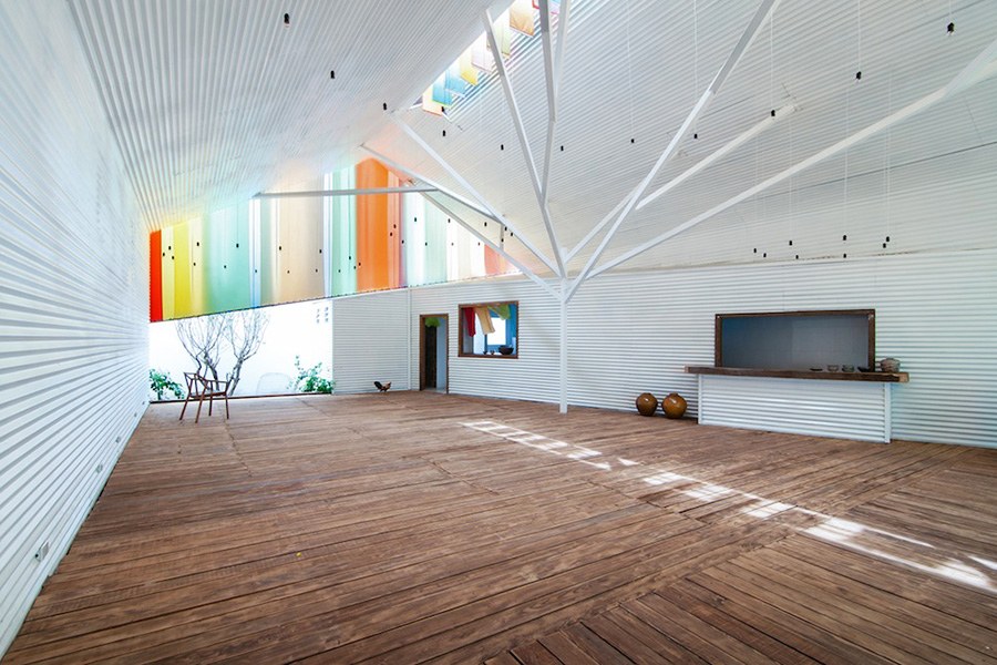
The Chapel / A21 Studio

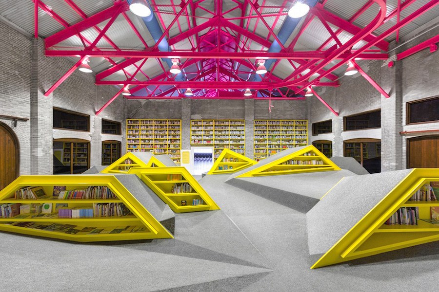
Niños Conarte / Anagrama Architects

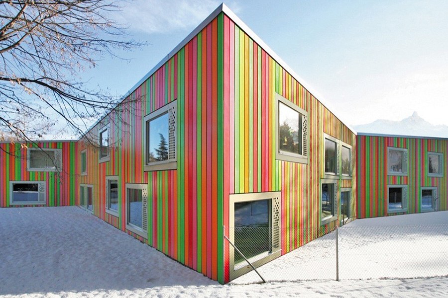
SAM Monthey Kindergarten / Bonnard Woeffray Architectes

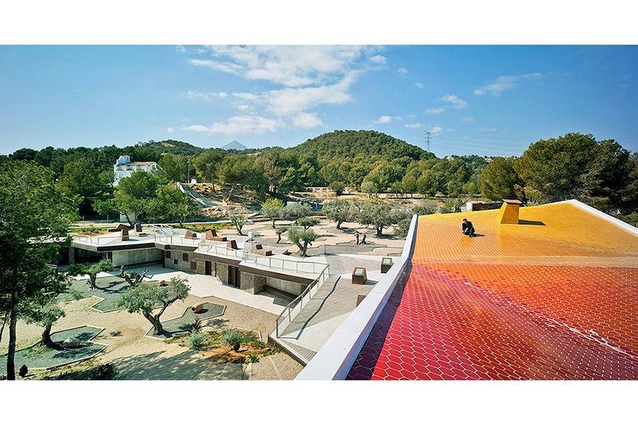
Environmental Education Center El Captivador / CrystalZoo

Sugamo Shinkin Bank / Emmanuelle Moureaux


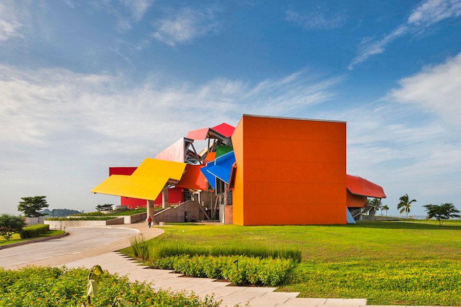
BioMuseo / Frank Gehry

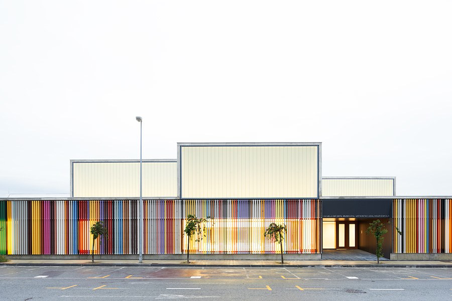
Nursery School / Javier Larraz, Iñigo Beguiristain, and Iñaki Bergera

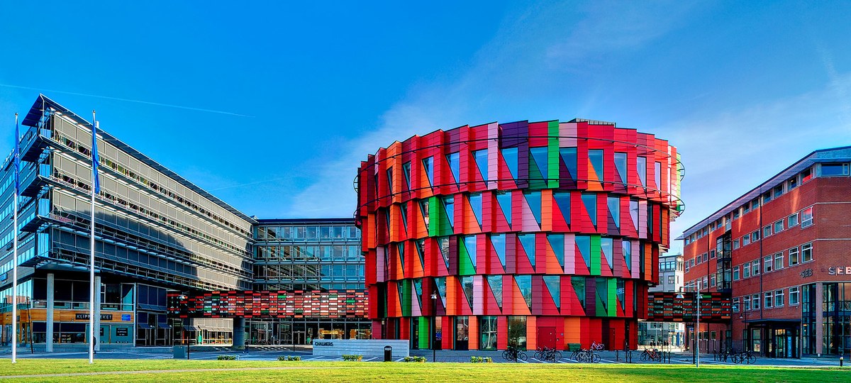
Kuggen Building / Wingårdh Arkitektkontor

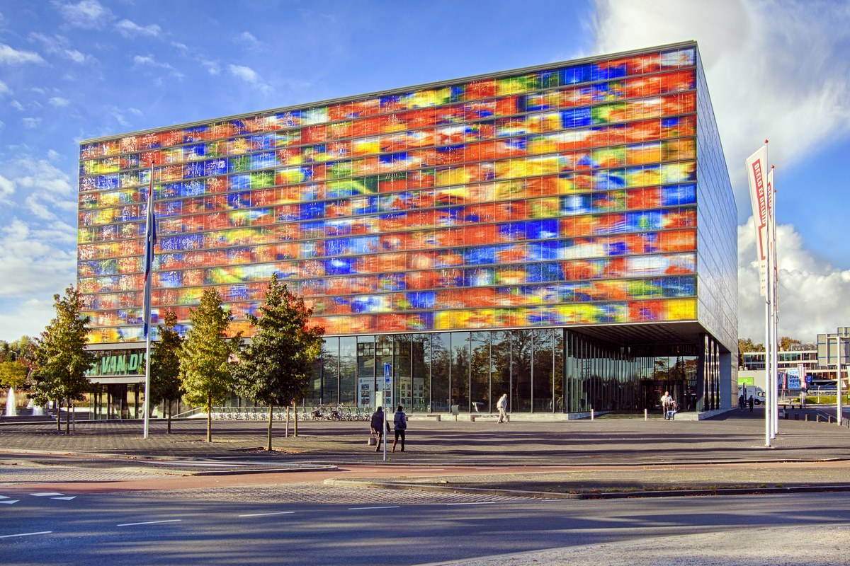
Netherlands Institute for Sound and Vision / Willem Jan Neutelings and Michiel Riedijk

Santa Monica Civic Parking Garage / Moore Ruble Yudell Architects & Planners
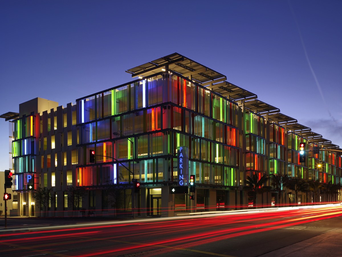

An overuse of colors can quickly turn from an architectural feat, to an eyesore. Harnessing their creative might, the architects that designed the above mentioned buildings have proven that a multi-colored building can not only catch ones attention, but make a powerful statement in the process.


